

Do you like what you see in F1 these days in terms of liveries? Who is doing the best job according to you? The worst ? Any preference?
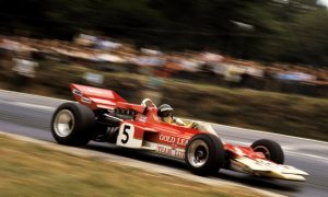
Going to Silverstone last year for my first live race, I got a much better understanding of the visual impact of the cars in real life. I have to say the designs that stood out the best were the Ferrari’s, Martini Williams and the matte Red Bull’s.
The different paint texture really set them apart and I love the fact they have tried something different with the application of the livery. I feel we should see some more paint technologies demonstrated in F1 as with such a hi-tech sport it’s a shame the livery itself seems to get left behind.
The core process of paint and stickers hasn’t changed from F1’s first inception so I feel there should be more development on this in future and Red Bull went with the first steps to providing something different! Another special mention to the Toro Rosso cars this year, again a great use of material finish and was the best looking car on the grid, both in body style and livery!
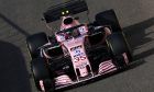
In terms of the worst, I have to say I was massively disappointed with the McLaren livery this past season. I just feel they have to be bold enough to fully embrace one direction be it retro papaya, or push the brand forward into the future. Last year’s livery was a real mish-mash of both and the different material textures of the paint finish honestly did give it a GP2 feel.
You just have to see the brilliant reception they got for the Indy livery (in partnership with Andretti Autosport) with Fernando Alonso. It showes that they know how to get it right so I’m sure they will be able to live up to that and this years was just a blip!
Where do you find inspiration to create each new project? Do you get from your clients the space and freedom you need?
It can vary from client to client, some are complete start ups or are going through a brand refresh so will provide the basic colours and leave the rest to me. Some of the designs I have been working on that we will see in 2018, however, have such a rich history that you simply can’t tamper too much and it’s a case of adjusting and improving the ‘fit’ of the livery to the car.
A lot of my inspiration comes from classic cars and liveries as again it’s what connects best with the fans is what will give an instant reaction. But looking forward I like to look at the graphic work done by the football clothing brands of Nike and Adidas. Their advertising campaigns are brilliantly modern and the textures and patterns they use is always great. The colour choices are usually very bold as well and lend for some great inspiration
Can you tell us more about your creative process? Do you have a method or does each project have its own history?
Usually creating the templates is the hardest process. I usually get high-resolution images or CAD files to create the views of the car I need. Then a case of redoing the highlights and shadows as close as I can to the real cars over the top of the design to give a ‘photo-realistic’ effect to my renders. This has especially worked well with clients before looking to bring in new sponsors, so to show them how the car would look in their corporate colours with designs ‘on track’ really helps sell the teams points.

While Sean was no fan of McLaren's 2017 F1 livery, Fernando Alonso's McLaren-entered Andretti Autosport's IndyCar received the designer's stamp of approval.